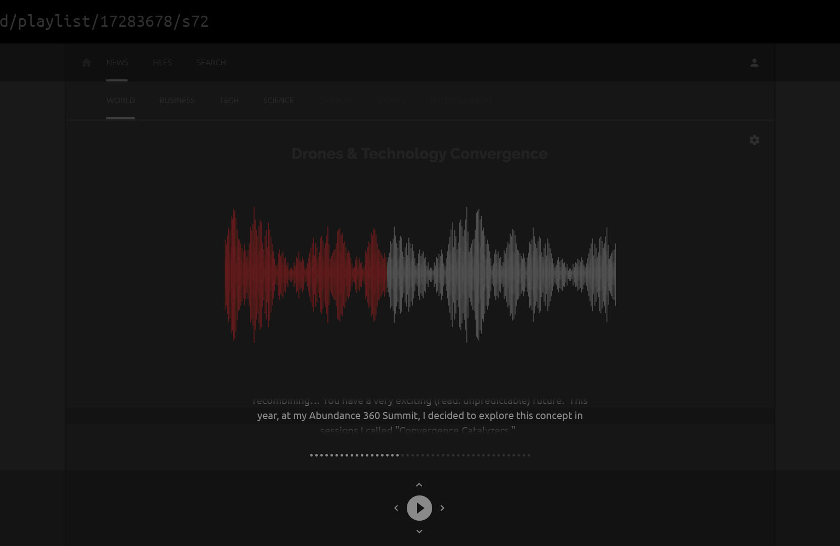
Whenever I try to catch up on the news or research a topic, I find myself opening new tabs for every interesting link or recommended article, until they get so dense that I can’t see the page titles – at which point I start to purge: skimming through articles that I should really digest, discarding pages that lost my interest, and often leaving with a fraction of what I set out to get.
I’ve used several news readers (there are plenty of available services) and currently I get most mileage from Panda for Chrome. At the core, all of these services facilitate access first and experience second. They focus more on sources, trends, and frequency of updates; and less on article contents, categories, and methods of delivery.
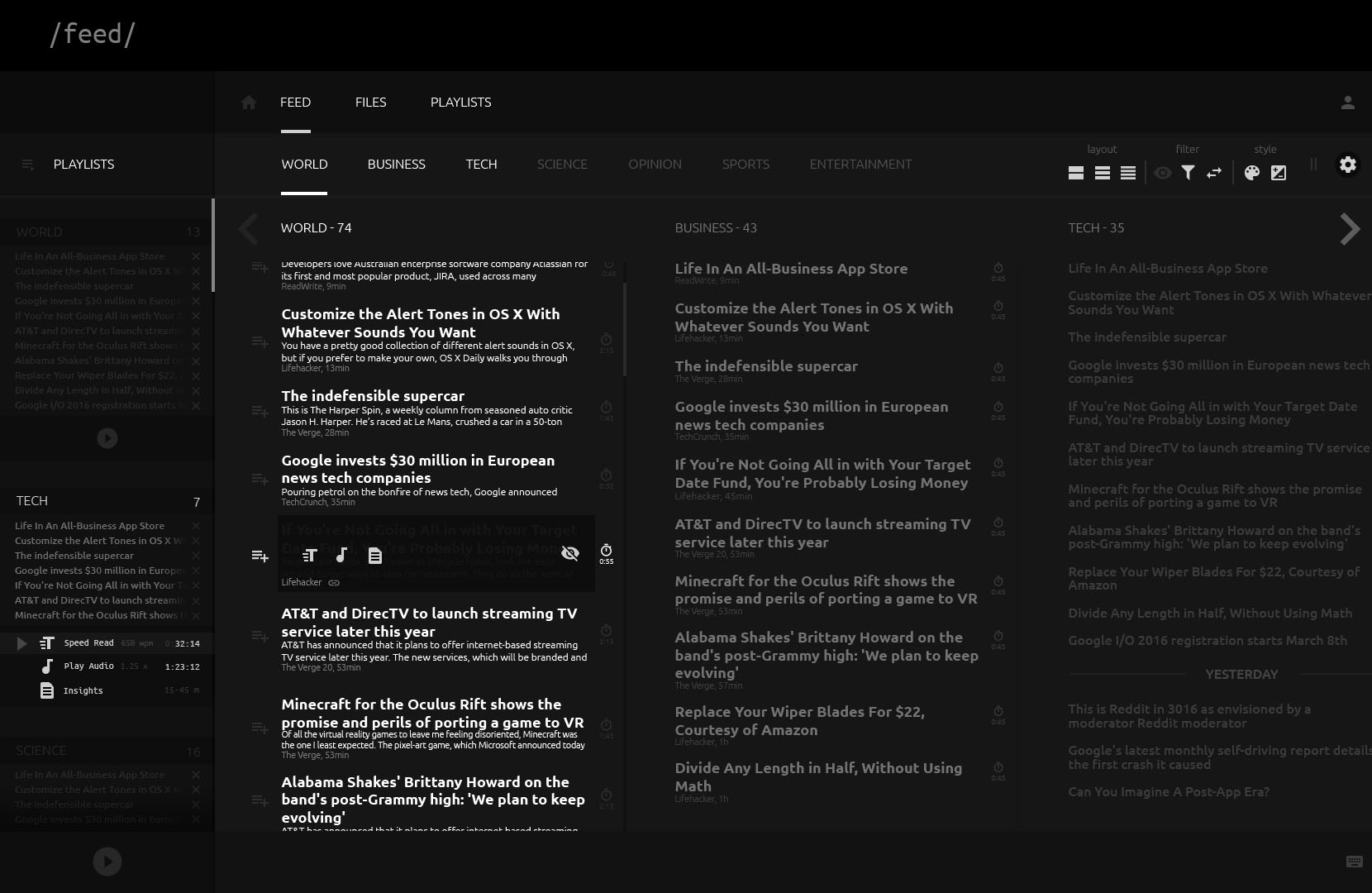
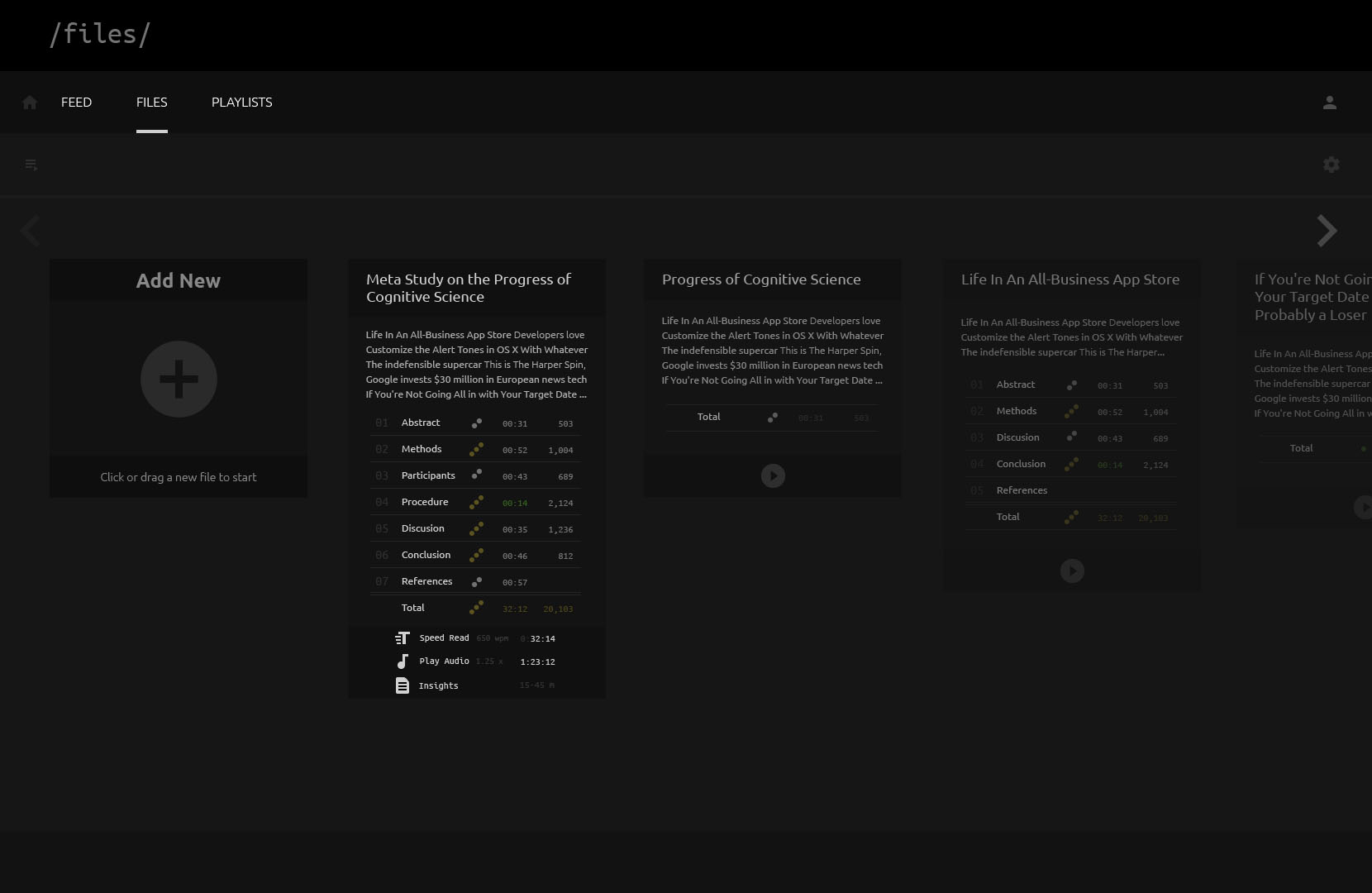
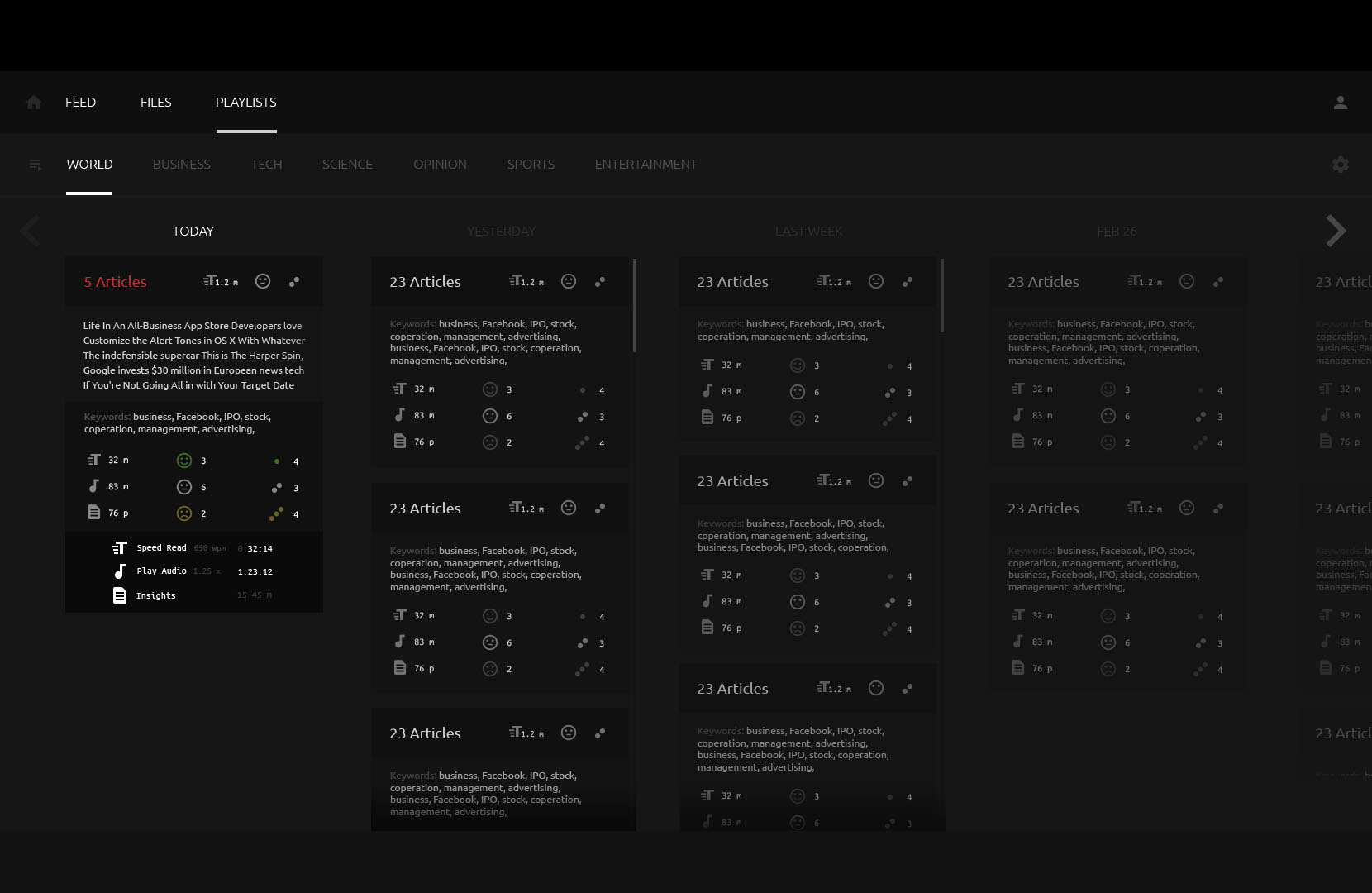
I set out to draft an alternate UI with features for an improved reading experience:
- ablility to make cohesive “playlists” of articles before diving in
- playing TTS audio (where a sufficient amount of text is available for conversion)
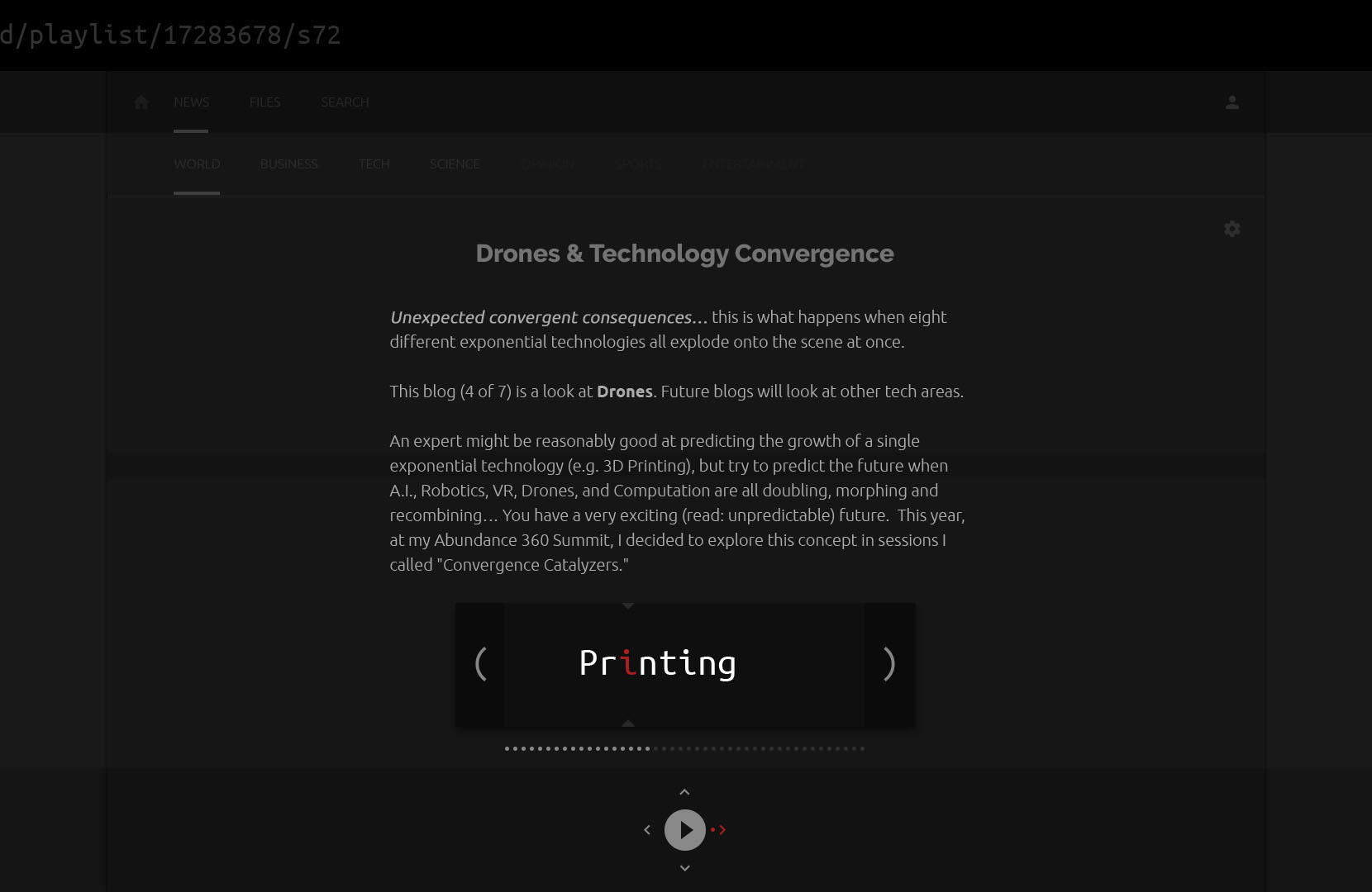
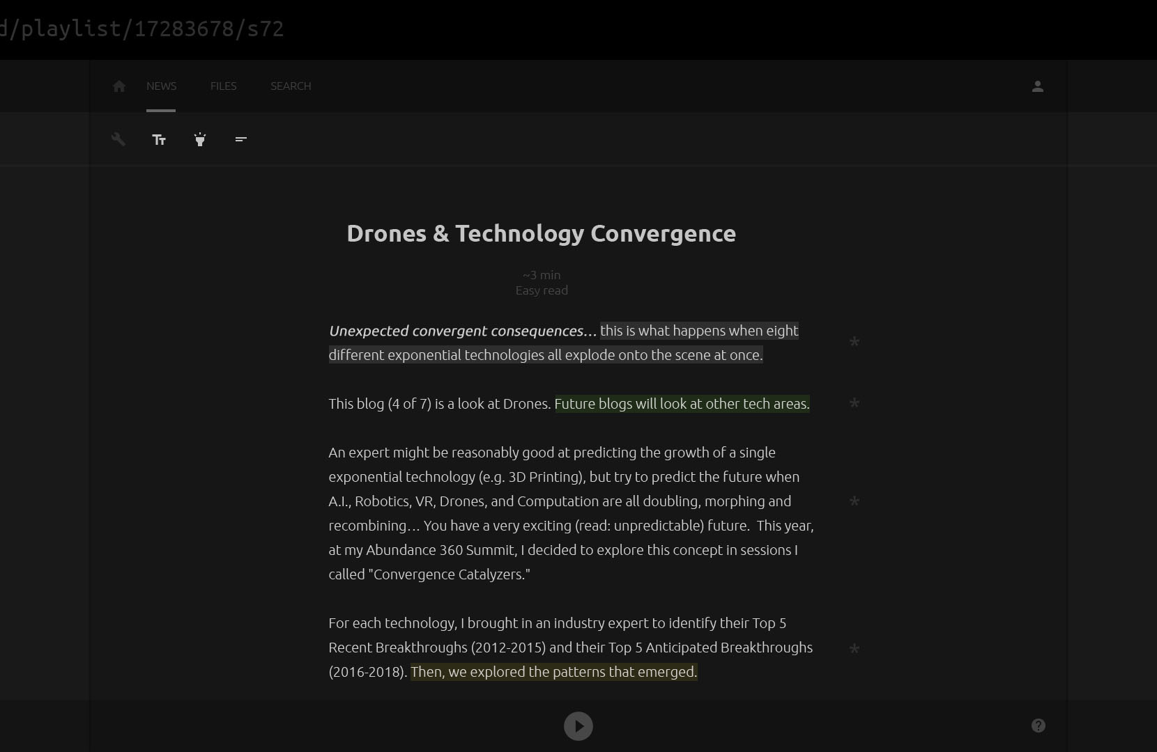
- speed reading available text in the dashboard
- highlighting important parts of the text with:
- salience scores
- sentiment values
- entities (relevant people, places)
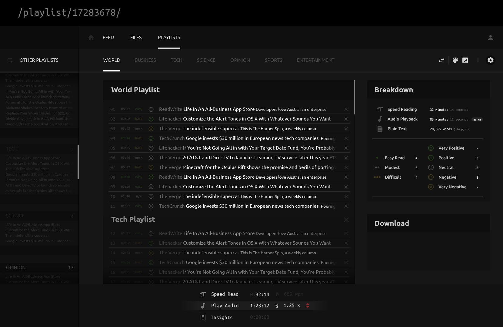
The dark theme might be a little too dark (it’s just a concept!) but it has potential benefits over a lighter theme. Prolonged reading from a screen can become unbearable over time. This is largely because most pages’ backgrounds are white (or light) – so the screen is beaming its brightest spectrum into your retinas. Whereas a predominantly dark color scheme would facilitate a more sustained and relaxed reading experience.
